Pantone Colour of the Year 2000 – 2014 - Pantone Colour of the Year 2000 – 2014 - Pantone Colour of the Year 2000 – 2014 - Pantone Colour of the Year 2000 – 2014 - Pantone Colour of the Year 2000 – 2014

Starting in 2000, Pantone’s Colour of the Year has become a hallmark of design, fashion and everything in between.
Over the years (2015, 2016 & 2017) we have been writing about Pantone‘s Colour of the Year. Here is the moment to look back, how it all began in year 2000 and how each memer of the colour family represents current trend in fashion, architecture and design in general.
A muted, yet still vibrant purple took the top spot in 2015.
PANTONE 18-3224.

Perhaps a not so subtle warning to the Greenery (2017) skeptics out there, green made a triumphant return in 2013 with Emerald. Wizard of Oz anyone?
PANTONE 17-5641.

This name says it all.
PANTONE 17-1463

A fun, bright pink injected life into everyone’s wardobe and house.
PANTONE 18-2120.

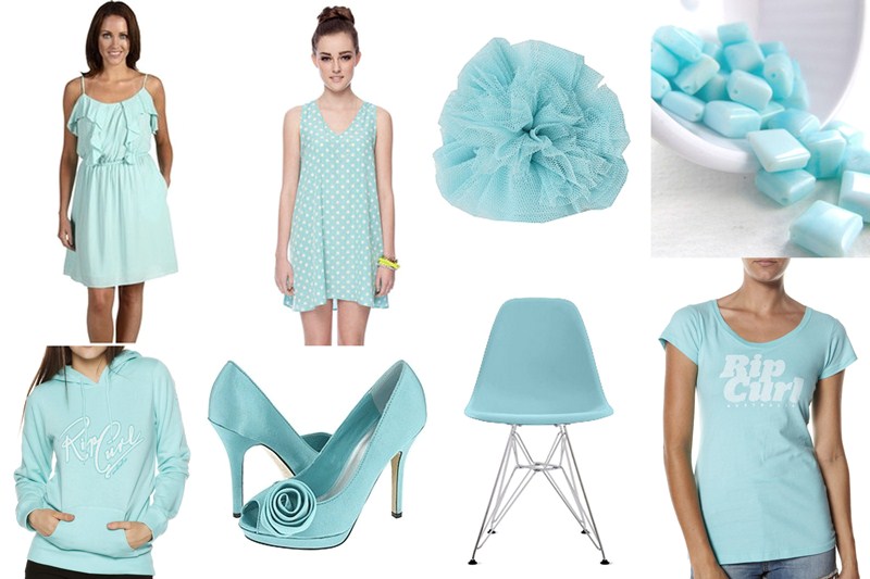
A variation on the Blue Turquoise seen in 2005, the naughties really were Turquoise’s heyday. Has anyone seen much of this colour since? We thought so.
PANTONE 15-5519.

Who wouldn’t want walls to match their drink? Oh the SUN. Summer, fun, hot days at the beach. A powerful color, full of life and promise.
PANTONE 14-0848.

A purpley, blue-ish hue which gave a serene feel without being too dark. It’s overpowering. Not really blue, not really purple … True fashion colour.
PANTONE 18-3943.

A rich, deep red that could be used for anything statement worthy; whether it be a wall, a couch or a rug, Chili Pepper’s heyday was surely the mid-noughties. How can you go wrong with this shade of RED? After the quite color of 2006, there was a need for PASSION.
PANTONE 19-1557

A practical neutral, Sand Dollar saw Pantone’s first non-vibrant hue claim the top spot. A popular choice for walls and exteriors, Sand Dollar also had a moment on the runway the same year.
PANTONE 13-1106

It seems we just can’t get enough of calming blues? Pantone must really like Turquoise. Another natural colour, Blue Turquoise is calm and cool, evoking a tranquil sea.
PANTONE 15-5217

Daring, fierce and a little bit different, Tigerlily clashed with the statement pink walls of 2001 but no one cared — orange was the new everything.
PANTONE 17-1456

In a dramatic twist away from the reds and pinks which dominated the last few years, Aqua Sky bought back the sense of calm which 2000 heralded. The light, yet still quite bright colour may have inspired millions to invest in a holiday home. After Cerulean in 2000, they came back with a soft color, full of hope for clear skies.
PANTONE 14-4811
It seems 2001’s colour, Fuchsia Rose, was just too hard to let go of. True Red was the sophiscated, grown-up version of it — reminding people a simple primary colour could still be a bold choice. After the events in 2001, there was a need for a color to honor those fallen. “True Red was a color symbolizing hope and love, the lifeblood of a nation in recovery.”
PANTONE 19-1664

Vibrant and out there, who didn’t have a Fuchsia Rose statement wall after 2001? “Fuchsia Rose is a sexy and stimulating colour, perfectly capturing the spirit of confidence and optimism of a world entering a new millennium and looking forward with renewed energy to a new era of creativity to be shaped by designers across the globe.”
PANTONE 17-2031

A gorgeous pastel hue meant a peaceful, calm start to the 21st century. A rejection of 90s dark wood, blacks and the strong influence of brown, Cerulean was a fresh start for more than just Pantone’s new venture. “Cerulean Blue suggested serenity and inner spiritual peace during a major turning point in human history.”
PANTONE 15-4020

Links and sources:
Mark Brand Group – Radiant Orchid
Fishy2me – 2012 Tangerine Tango
iDesignArch – Honeysuckle – 2011 Colour Of The Year
The Design Dish – Color of the Year 2010
A Slice of Life – Years by Colors